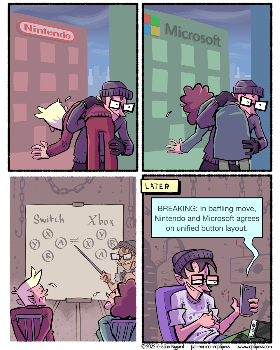
Consolidation
I bought a Nintendo Switch a little while back (my first Nintendo console!), and the mismatch of these buttons has been driving me insane.
Despite this infuriating problem, Breath of the Wild is indeed very, very good. How come no one told me 4 years ago?!


I bet this whole button scandal is due to IP laws. Boy would a unified button layout make everyone unhappy. Might as well be A / B X / Y so everyone is equally unhappy
Navarr, I like your button layout of A/B,X/Y better than anything else. Any other layout doesn’t stick in my head, as there are no mnemonics that make sense to me for either the Nintendo or Microsoft layouts.
(And if anyone DOES know of some nice mnemonics, please let me know!)
Now, Nintendo and Sony follow the same layout for confirm/cancel and misc buttons, but Sony actually made a gamer move and swapped the actions without swapping the buttons for the western audience (because who tf knows outside of asia what 〇✕△ even mean), so Microsoft had someone to copy as a direct competition, so it’s all a weird mix of the same-but-slightly-different-plz-don’t-sue-us layout on all major platforms
In Japan ○ means good/positive/correct, and × means bad/negative/incorrect.
Welcome to the club :)
I’ve tried a lot of switch titles, the two that stuck the longest were: The Binding of Isaac, and Slay the Spire. In case you have too much free time ;)
Well, Nintendo did it first. That was the button layout on the Super Nintendo. Nintendo just stuck with it. Then when Microsoft made the first Xbox they decided to swap it for some reason. Likely their lawyers made them do it to avoid lawsuits.
Good on Sony for coming up with something totally different.
Sega had that layout first:
https://en.wikipedia.org/wiki/Sega_Genesis#/media/File:Sega-Genesis-6But-Cont.jpg
The Dreamcast (still before Xbox) even had the 4 button layout (no C and Z): https://en.wikipedia.org/wiki/Dreamcast#/media/File:Sega-Dreamcast-Cont-n-VMU.jpg
TBH, A,B and X,Y being ordered left to right is more intuitive than the other way around, even if Nintendo was first to use those labels and used the wrong order.
Or maybe Nintendos lawyers were indeed more scary than Segas
Dead Cells and Hollow Knight are also really good on the Switch. (But not exclusive to it.) Same for Spelunky 2.
Nintendo’s layout is just the manga version of Microsoft’s layout.