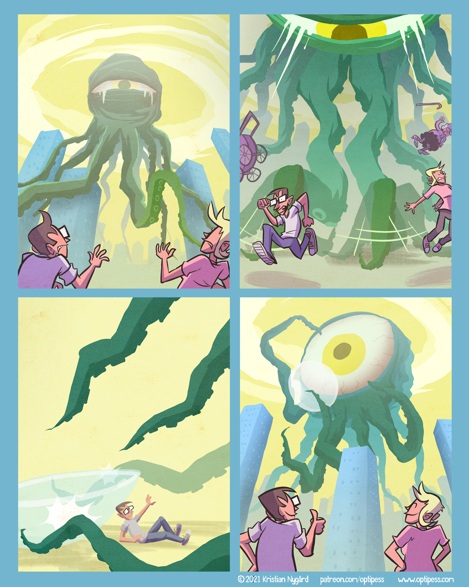
Monstrous Contact
Decided to push this comic back a bit, and ended up spending the extra time going for a different style with more flat and saturated colors and less lineart. I like how it turned out so I might experiment more with this approach later on!


Whoa! I like this style! :D
I like it! All on its own it might be a bit much, but combined with your usual style for the people, it’s a really good effect. Also like the subject.
Thanks! Yeah, I planned to draw all the characters in a similar style, but in the end only my attempt for the third panel remained.
The mix works GREAT.